The Ask the Analyst series is a deep dive into the data by those most familiar with the CO APCD – the analysts themselves. We’ll hear about their experiences with recent analyses and answer any pressing questions that come up. Have a question for the CIVHC Analyst Team? Email it to info@civhc.org.
Analyst Name: Ioana Crisan
Featured Project: Community Dashboard
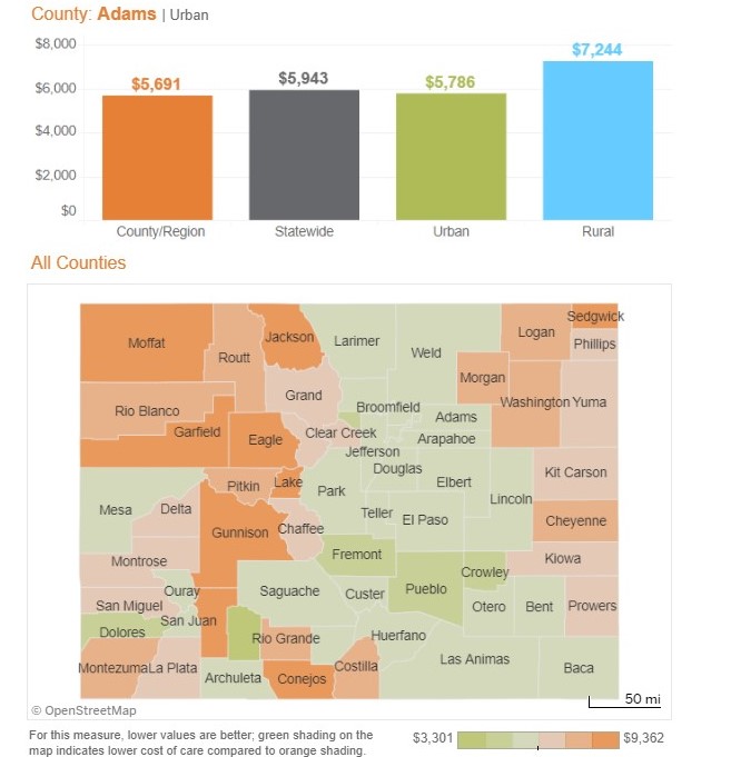
The Community Dashboard is a publicly available report, refreshed annually, that helps communities understand how their health care cost, utilization, access and quality of care compares to the state, other counties and regions. This information can be used to help identify opportunities to improve care and lower cost, and track trends towards positive change.
What were your first steps when beginning this analysis?
For the 2021 refresh, based on stakeholder feedback, the CIVHC team suggested the addition of some exciting new measures to the report. They include potentially preventable hospital admissions, potentially preventable Emergency Room visits, mental health Emergency Department visits and a few new access to care measures. The first steps involved assessing the data and the methodology for developing these new measures.
Were there specific factors you needed to consider based on the data?
For the 2021 iteration, we engaged in a complete redesign of the report. The addition of new measures prompted our teams to reconsider the presentation of the data. Rather than choosing between a profile view where all measures are presented together for a selected geography, such as a county, and a measure-level view for all geographies presented together (ultimately, displayed as maps), we prototyped a dashboard re-design that included both.
What challenges did you encounter while performing the analysis? How did you overcome them?
Given the expansion of scope for this iteration, with the addition of new measures and the substantial facelift to the interactive dashboard, we (both CIVHC and HSRI) increased the number of dedicated contributors to the development of this report which helped us successfully execute deliverables according to the timeline.
Without delving into results, did anything surprise you about this analysis or the process of executing it?
One thing that interests me is whether rural regions fare worse that urban regions for the measures included in this report. That is not consistently the case, which is surprising, though positive. For example, some access to care measures—both for children and adolescents and for adults—have consistently across time and payer types had similar or occasionally better outcomes for rural counties than for urban counties. These and a few others are exceptions, as most often we observe what we would intuitively expect, which is that overall, Coloradans residing in rural counties have higher costs, lower quality of care and worse outcomes for utilization measures.
What did you learn while performing this analysis?
One aspect evidenced in the annual trends snapshots available alongside the interactive dashboard is that the cost of care per person per year, overall across all payer types, continues its upward trend. On the other hand, there are a few other data points highlighted in the Overall Trends and Annual Trends that show some promising changes in Colorado’s health care landscape.
View the Full Report


