
Emma Anderson, MA, Sr. Health Care Reporting Analyst, Team Lead
By Emma Anderson, MA, Senior Health Care Reporting Analyst, Team Lead
It’s a massive, carefully coordinated effort to define, gather, and clean data from 40 distinct payers, but ultimately the payoff is huge. With over one billion claims in the Colorado All Payer Claims Database (CO APCD), there are seemingly endless questions to ask regarding health care in Colorado – and it’s easy for CIVHC analysts like myself to get lost in the data and in questions that grab our attention.
But early in my career, I learned that data is only as useful as the insights we can derive from it. Billions of rows of data are overwhelming and ineffective unless we can effectively communicate what that data tells us. And to make data more meaningful to our partners and Coloradans, CIVHC presents the data through visual storytelling.
At CIVHC, successful storytelling through data visualization begins by asking “who is our audience?”. We work with a wide range of partners around the state, and we also create reports for health care consumers. One of the biggest challenges we face is there are multiple types of users and potential ways to use the data, from a consumer shopping for health care, to a legislator, provider or state agency trying to understand provider payment variation or low value care. This means that when I develop a new report as an analyst, I must constantly keep in mind not only who the user is and how they might use the information, but also what their comfort or level of familiarity is with the CO APCD and even data in general. This understanding is the foundational building block for successful data storytelling.

Once we have identified our audience(s), our team defines the research question and potential use cases for the report. CIVHC engages in direct feedback from our partners in order to do this – determining what they are interested in learning, what questions they need answered, and most importantly what insights are necessary to take actionable steps to further their goals to improve health care. After these conversations, I am able to begin sketching out (with pencil and paper – I’m so old school!) the types of visualizations and ways to break down the data to make it actionable. From designing the graphs and tables which give meaning to the data, to adding interactivity and context to help users understand what the data shows, our key consideration is our partners and Coloradans.
And with the help of our new visualizations and key experts both at CIVHC and around the state, we are able to identify the “Aha!” insights. Organized in a meaningful way, public CO APCD data analytics can answer questions and help identify where we should focus improvement efforts and track progress as a state.
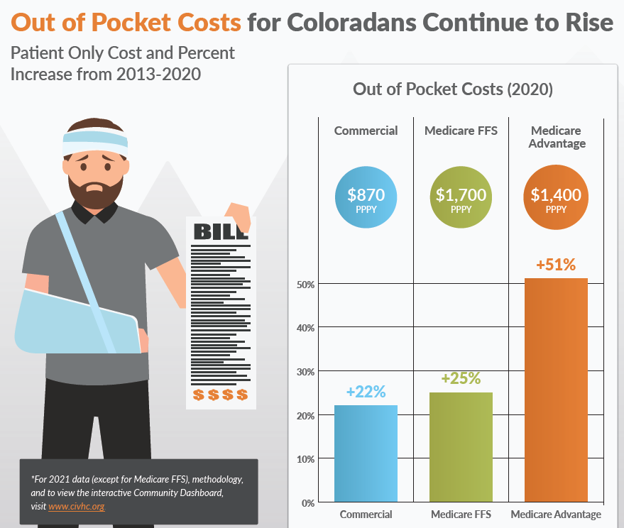
And lastly, CIVHC takes special consideration to help our partners and the general public develop potential action steps and disseminate key findings through infographics, blog posts, and written reports that help distill sometimes complex topics into bite size nuggets of digestible information.
The vast amount of public information we provide is part of our mission to equip partners and communities in Colorado and across the nation with unbiased data they need to improve health and health care. Ultimately, our vision is that everyone has the opportunity to be healthy and has access to equitable, affordable, high-quality health care. Clearly, I have a passion for creating actionable, insightful, user-friendly reports from complex, messy, and raw data which directly supports our mission and vision. And this is why I find my work here both compelling and fulfilling – CIVHC not only has the data, we use the data, and we share it. And our passion is making sure others can use it too.
