Analyst: Ioana Crisan, Human Services Research Institute,Director of Health Care Reporting

Project Name: Health Equity Analysis

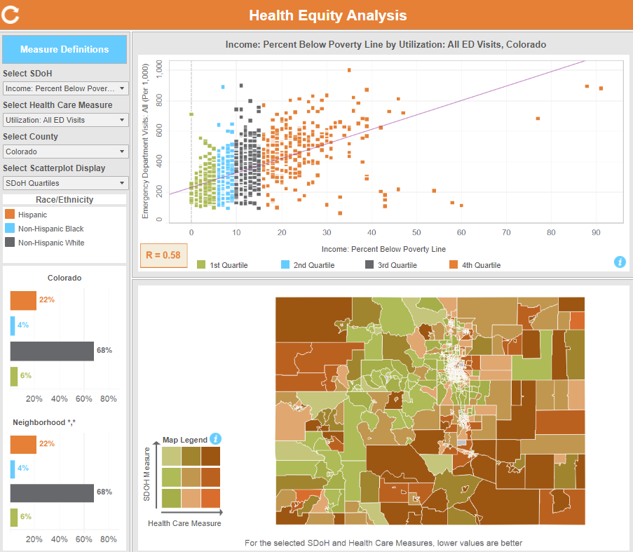
Project Purpose: The Health Equity Analysis shows the relationship between key social factors and access, use, and cost of health care services that can impact a person’s health.


What were your first steps when beginning this analysis?

The idea to develop this type of analysis and visualization came from conversations with CIVHC’s former Director of Research and Performance Measurement, Maria de Jesus Diaz-Perez. We were discussing the importance of contextual information that speaks to the social and environmental conditions of neighborhoods where people live, and looking at how those factors impact health outcomes. We were aiming to develop a visualization that would support community organizations and other stakeholders to better understand the relationship between these sets of measures in Colorado. We had seen some good APCD-based analyses developed by other states and were excited creating an initial prototype. The version published on the CIVHC website has improved significantly from that initial version through the diligent work and thoughtful feedback from CIVHC and HSRI team members, as well as some of CIVHC’s external partners.

Were there specific considerations you needed to consider based on the data?

The health outcome measures used for this analysis were originally developed for the Community Dashboard, where the smallest geographic unit displayed is the county. There can be a lot of variation in both socio-economic characteristics and health outcomes that is obscured when looking at county-level statistics. With the Health Equity Analysis, we were determined to get to a higher level of granularity, knowing that it would be of value to many to reveal some of the patterns that are visible only when exploring neighborhood-level data. The report team landed on using the Census tract as a unit of analysis, since it is often used to study geographical patterns for social factors and population health. Through the benefit of having geocoded all addresses for people in the CO APCD, and obtaining Census tract identifiers for each address, we were able to develop tract-level statistics.

What challenges did you encounter while performing the analysis? How did you overcome them?

There were a few methodological, technical and visualization challenges in constructing this initial version, and I will name a couple.

  1. Some of the health care measures have a very low volume of claims when calculated at the census tract level, and in such cases the resulting statistics are suppressed (following privacy protection standards used by the Centers for Medicare & Medicaid Services (CMS)). We then combined multiple years of CO APCD data for these measures, to be able to reduce the number of suppressed statistics.
  2. Another challenge was in ensuring that the visualization of the relationship between pairs of measures was both informative and actionable, and not overly complex for a public audience. Originally, we started by displaying just the scatterplot chart, then based on these considerations we added the map so that report users would have the flexibility to identify and explore geographic areas of interest, zoom in or out, and highlight selected census tracts in both charts.

Without delving into results, did anything surprise you about this analysis or the process of executing it?

For the most part,  this analysis was not expected to reinvent the wheel – a lot has already been researched, reported, and visualized about social factors influencing health outcomes, and what we see is very much in line with those established findings. However, it is notable that, statewide, lack of access to care for adults is strongly or moderately related to the selected social factors, however lack of access to care for children and adolescents has a weak or no relationship with the same social factors. In other words, whatever the socioeconomic factors of their neighborhood, children’ and adolescents’ primary care provider visits have a similar rate, whereas for adults, the higher the poverty or unemployment in their neighborhood, for example, the less likely that they would have an ambulatory or primary care visit.

What did you learn while performing this analysis?

The greatest learning experience was being able to use this tool myself after it was built, which also sparked quite a few ideas to consider for future versions of this analysis. I think it is very valuable to have access to this type of tool and explore health care utilization, cost, access measures as well as socio-economic characteristics, available statewide and at this level of granularity. This analysis is an excellent reminder of the value that the CO APCD with enhanced geographical information can bring to those looking to improve Coloradans’ health and health care.

View the Health Equity Analysis

View the Health Equity Analysis Webinar